Hello,
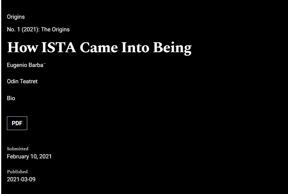
Working on a Journal with Immersion Theme, I have noticed that the author’s info display a bit more dispersed and less concentrated than with other themes, where they appear more close and a in a way a bit more condensed. In particular, I am referring to some extraspace which appears between the affiliation and the Bio. Also the word Bio strangely is not underlined, even if it is a link somehow.
Could these two aspects be a bit revised, according to you? There could be some extra custom css code for now to insert?
I make a comparison here between the display in HealthScience and in Immersion.
With my best regards,
Leonardo

