Hello,
I have activated the option that allows to show the Journal description in the homepage. This is useful in order to have a textual description, of course.
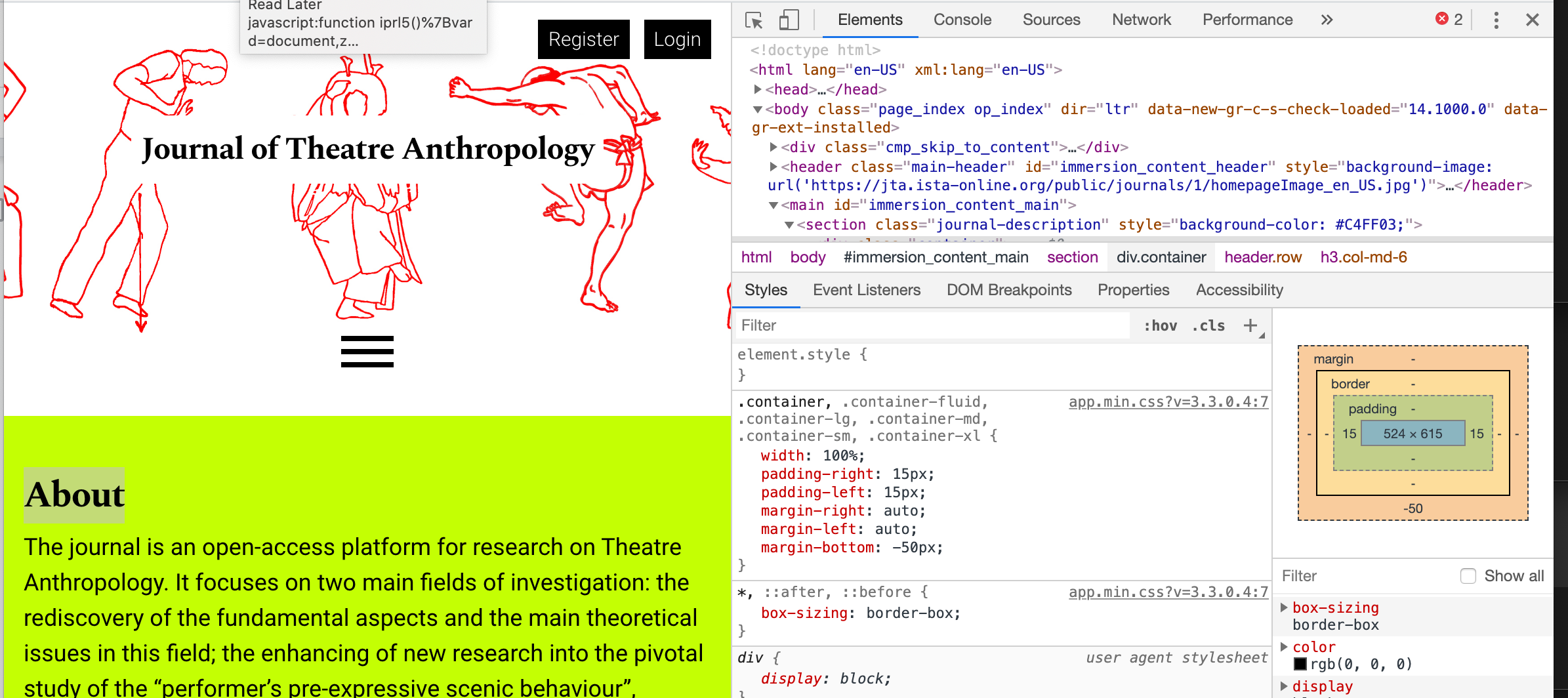
I wonder if I could try to reduce a bit the space which is created between the hotizontal menu and the beginning of this text. The same space appears less large before the next section, and in my opinion this second way keeps things a bit more condensed, in a positive sense.
Do you think that I could also reduce a bit the extra space before the Journal description text in the homepage?
And furthermore: do you think that I could hide the “About” word?
I attach a screnshot in this regards.
With my best regards,
Leonardo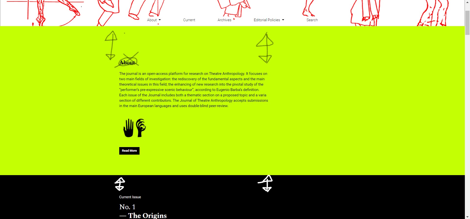
Hi @leonardo.mancini,
Can you provide a link to your site with this example, so we can have a closer look?
-Roger
PKP Team
Hi @rcgillis,
Thank you very much. Here is my journal: https://jta.ista-online.org/
Best regards,
Leonardo
Hi @leonardo.mancini,
This could be a little tricky, and may not be possible/advisable. The reason why is it seems that this particular property is governed by the container div, which, while it can be adjusted, adjusting the property in a custom CSS of a commonly used element like container may have consequences in other areas of the website. See here - I’ve adjusted container properties to include margin-bottom: -50px in the container div using inspect element tools(you may have to download and zoom in to see it):
There may be other ways of going about it, but, because this is a similar scenario, I must emphasize the advice of @NateWr in one of your other posts:OJS+Immersion: issue's description display on the homepage and in the issue's page - #3 by NateWr
"To be honest, I’d recommend leaving it as-is. The design was made that way on purpose by a talented designer. Trying to use up all of the available space is a common design mistake that designers spend a lot of time pushing back on. In this case, the line length, line height and font size are carefully balanced to make the text more readable. It’s really best to leave these things alone unless you have a professional designer guiding the changes.
-Roger
PKP Team