Thank you @Vitaliy for developing the nice theme. We have used the OldGregg Theme for our New Journal. Since the journal is new and does not publish any papers yet so we want to show some information about our journal to the homepage above the Latest Articles section. If possible please guide me so I can create a text block above the Latest Articles section or below the Latest Articles section.
Url: https://researchj.com/index.php/rijb
Hi @Farhad_Hossain,
OJS uses Smarty templates to create HTML code on the front-end. It’s something between PHP and HTML. The header for the latest articles section is here:
So, to put the code above it you can simply add your custom HTML there.
Also, you may want to take a look at the theming guidelines: PKP Theming Guide
If you want to add some additional information from the OJS, the situation is more difficult, you need to know general concepts of how to deal with plugins and assign data to Smarty: Passing Data to Templates
Dear @Vitaliy,
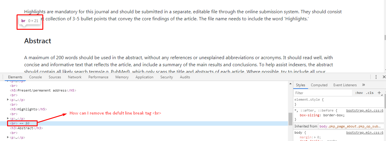
Thank you for your above guideline. However, I am facing a new issue. I have added contents in the Author guidelines sections but it generates default line break tag (br) end of every line.
Please help me to remove the default line break tag (br) from Author Guidelines.
URL: https://researchj.com/index.php/rijb/about/submissions
Hi @Farhad_Hossain,
These tags come from TinyMCE form. Can you double check you input there? Settings -> Workflow-> Submissions -> Author Guidelines TinyMCE form -> Source code button.
Thank you @Vitaliy. I have fixed the issue by putting the following CSS code to my style sheet.
br {display: none; }
Hi @Vitaliy
Any info for the new oldGregg?
1 Like
Hi @kawahyu,
Still working on it, you can view the progress on the dev branch: GitHub - Vitaliy-1/oldGregg at dev
I’m working on the theme mostly on Saturdays or Sundays when I have free time, that’s why it takes so long. I’ll leave the basic features that were in the previous release (Issue slider, latest articles), maybe add new ones, like most viewed articles or the latter will go in v.2.0.1.
JATS Parser Plugin will be decoupled from the theme. Much work on it is done and the next release of the plugin will allow showing JATS XML on article landing page with any theme. This was available only for Old Gregg before. Certainly, official themes will require styling for that component and it can take some time to adapt them.
I’ve posted it already, but the style for the new version of Old Gregg for simple pages is looking like this:
Actually, you can help if you’d like. I’ll work on the journal index page on the next weekends or two. It will utilize components like latest issue slider (already implemented), latest and most viewed articles, categories, announcements and journal description. I’m thinking about designing those. I’m ready for suggestions if you or anyone else interested share some ideas in respect to design. E.g., would it be better to use tabs there or not (latest and most viewed articles)? How categories should be better presented on the index page? Is there anything else worth to present on the index page?
I think those features in the index page are great. I made some modifications in my index journal https://jurnalbeta.ac.id. I think the features could be arranged as follows:
First, the latest and most viewed articles are better to use tabs. Each will use more spaces if it is in a separate position
Second, journal description remains in the same position and the announcement will be under issue slider. The categories could adapt the Critical Time https://ctjournal.org/index.php/criticaltimes
From the screenshot, significant changes are the header and footer. I personally like the format of the header but some journals especially Indonesian journals are used to placing a large logo in the header and prefer a simple, e.g., three columns, footer. If it is the fixed header, then I suggest having a way attached image/logo as the background.
It is all my personal preference. The others might have different ones.
How about the article page? Is it similar to the latest release?
So, regarding latest and most viewed, one approach that I’m considering is just to make 2 columns. Tabs also make sense, I can try to adapt card layout in this case. The problem with tabs is that it’s not very user friendly if big number of articles is chosen to be displayed. This leads to excess scrolling, e.g. when user scrolls down the content and then must return to change a tab. One of the approaches could be applying horizontal scrolling.
Issue slider now is having prominent position at the top-center of the index page. I’ve done this deliberately because, in my opinion, it’s most important part of the content. Agree with a Nate’s approach for categories in Critical Times Theme, I’m thinking about the similar thing.
I prefer not to use fixed headers as they limiting the view. Logo can be placed on the left side of the header instead of journal title. Homepage image truly can be placed in a background but I can’t figure out where 
It is a nice position. what if the journal has one category, e.g., research article?
I like the way homepage image set in HS theme, the issue cover and description ‘hang’ in.
Hmm, displaying categories could be optional, e.g. user can disable it if has only one category.
1 Like
Hi all,
Beta release for Old Gregg Theme 2.0: Release 2.0.0-beta1 · Vitaliy-1/oldGregg · GitHub
Live Example: http://ojsdemo.e-medjournal.com/index.php/oldGregg
It’s compatible with OJS 3.2.
I’ve made a beta release first as a theme is completely redesigned and not yet fully tested.
Would be appreciate for testing and suggestions!
2 Likes
Hi @Vitaliy
Thanks for the release. The new oldGregg looks simple and clean. I am testing it here Mathematics Education Review. I have not upgraded my ojs and theme, still waiting the final touch of oldGregg. I have issue/questions/request:
Issues:
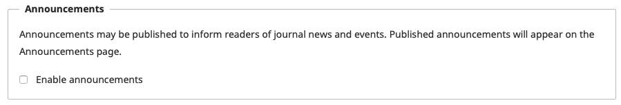
- I tried to disable Announcement but it is still in there

- I have activated Journal summary to be displayed in the journal index page but it does not show yet
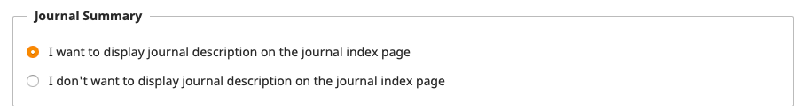 Where is the position of journal summary?
Questions
It seems that the XML galley is not shown in the article page. Is it under development?
Request
- If it is possible, the carrousel of current issues + journal summary/description + homepage image are placed together with two row format (left-right or top down position). I prefer left-right, making the carrousel smaller. it is like this https://read.dukeupress.edu/critical-times. This request is fully personal preference, others might dislike that format.
- Latest and most read are made as a nav-tab like this https://jmrionline.com/jmri. With this, it will be easy to add other tabs. List of latest articles could look like classic theme (row format)
Sorry if this request is not appropriate.
1 Like
For this feature JATS Parser Plugin will be solely responsible. Most probably, it will be available in the next major release. That is displaying full-text on article landing page. Visually, article landing page for this theme will be the same as in previous release if JATS Parser is activated.
1 Like
What about journal summary and announcement?
Yes, announcements can be showed on the journal index page. I’ve added them to the demo. Regarding journal summary, I’m still thinking how to style it.
1 Like
How to disable the announcement? In my case, although I have unchecked the Enable announcement it still appear in the indexJournal page.
Hmm, it looks like a bug. Can you open an issue on theme’s GitHub page? Issues · Vitaliy-1/oldGregg · GitHub