Dear PKP Community –
We published the first issue of our journal yesterday – big thanks and shout out to this community for all the help in the development process, especially @asmecher!
However, only after we went live did we discover that our HTML versions of the articles are wonky when viewed on a PC using IE, ipad and iphone. On the latter, the text just cuts off on the side and all of the sentences are unintelligable. Plus pull quotes we’ve painstakingly formatted in Kompozer are misaligned. I’m assuming that there’s some problem related to the settings for the size of the block text (at one point I thought I reformatted it to be no wider than 500pixels since it was going too wide, so this is likely the problem, but not I’m not sure how to fix it.). Maybe the 500 pixels is something that is “fixed” and to flow properly across devices and browsers the width needs to be relative? Is this something that I fix in Kompozer? Or where is this determined in the CSS of OJS? Help would be much appreciated.
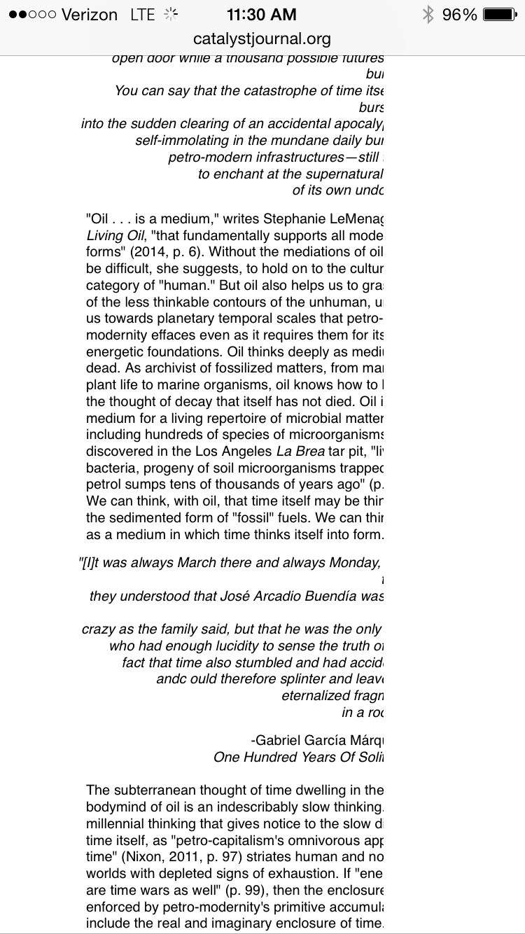
I’m including a screenshot of how an article is rendering on an iphone, with text cutting off on the right side, and the formatting wonky for italicised pull quotes.
Big thanks
MSJ
Hi @msengulj,
OJS uses percentages to define the 3 main columns width (the side bars and the content), therefore I don’t think that the problem is related with OJS css.
Can you post a link to the article in question?
Thanks,
Bruno
Thanks @beghelli, thanks yes that’s what I’m discovering, that for some reason Kompozer made all of our articles not percentage but pixels. All of our articles are having the same issue. I’m trying to go in and adjust the settings in Kompozer to achieve the same formatting but using a container and percentages, which I hope will solve it. Unless I could create a CSS page for the articles that would overrride whatever default settings (I do not recall specifying it to be pixel width but maybe I did …) are making this happen?
http://catalystjournal.org/ojs/index.php/catalyst/article/view/orr/html
Thanks for your quick reply and troubleshooting help.
Monika
@msengulj,
Your HTML has a lot of styles defined directly inside the HTML tags. And without any particular element class to target to, it’s hard to overwrite those styles definitions.
The best option is to try to generate the HTML in a cleaner way, without the width style definition. If you can’t do that, you can clean the HTML file, but that’s a lot more work.
Cheers,
Bruno
Thanks @beghelli, what ways are there to generate cleaner HTML without actually cleaning the file? And by cleaning the file(s) (there are 16 articles that do this, would that mean going in and deleting the line that says < body style="664px " > that sort of thing? Then how to get the formatting I want? At a meta level I totally agree, at a practical level, I’m not sure where to start. (Facepalm) Big thanks, Monika
@msengulj,
Generating clean HTML using WYSIWYG HTML editors is really hard. I am not sure how you’re using Komposer, but if you’re familiar with HTML and CSS, I would suggest you could start writing your own HTML and CSS, without depending on the HTML and CSS that’s generated by the other systems.
If you are not familiar with HTML and CSS, I would suggest you to get some help from someone that does, create a pattern for your articles, and then use this HTML pattern as a base for the others.
In any way, some HTML and CSS knowledge will be necessary.
Hope that helps a little bit.
Cheers,
Bruno
@beghelli, thanks for your input. We have already launched, and followed OJS’s recommendation in using Kompozer, and I have already written a CSS page to do modifications to the site as a whole, I’m loathe to have to redevelop 16 articles by writing HTML code of my own. WHile I can do that, it is a little late to get started and I would rather fix the width issue within Kompozer. I’ll post what I find out here so others who may face th same issue using Kompozer with OJS may learn. Monika
@msengulj,
The fixed width value will be a problem in any display that’s smaller than the fixed width value. So it’s a problem of HTML, CSS and the display you load it, not Kompozer with OJS. I hope you can quickly solve this issue.
Regards,
Bruno
Dear OJS community. I was able to solve the problem of articles designed with a fixed width dimensions by manually changing the < div > of the < body > of each article from absolute pixels to percentages. This actually was a fairly smooth process, considering how mystifying the problem seemed to me at the beginning. It took me under two hours to decide on the appropriate percentage numbers, to fix each article (16), including multiple pieces with embedded images and videos, and then to upload them to the site and check using different browsers and mobile devices with different screen sizes that they worked. With the exception of one that has poetic-like line breaks that do not scale well, 15 of them did.
For others using Kompozer to design their articles in HTML I would recommend the following, be sure that your dimensions are not defaulted to pixels during your design phase. If you opt to have made a template (As I did) be sure this template has the textual divisions < div > style specified in percentages rather than in pixels, which appear to be the default. Once the < div > container is made, I didn’t have any problems having pixel specifications within it.
I haven’t found an easy way other than manually changing the code in the “view source” section of Kompozer to make this change. I would welcome advice from Kompozer users who have done so. I write this here because I did not find any Kompozer forums to ask such questions from a community of users – aside from forums related to source code development for the software, which is a different community – and since OJS recommends Kompozer I thought this would be a useful space to share knowledge.
Not having the width set to relative percentages certainly proved to be a big headache for me – after publication and our first launch – when the articles wouldn’t render on mobile devices and I’m getting pinged with emails from people about this problem and thus unable to celebrate over a year of hardwork.
I’m glad I found the conversation fixed and I would welcome feedback from other OJS users who design their HTML pages using Kompozer, for tips and tricks on making the articles integrate smoothly in the future.
~MSJ
2 Likes