I am having a problem while using HealthScience v1.0.5 on OJS 3.1.2-4.
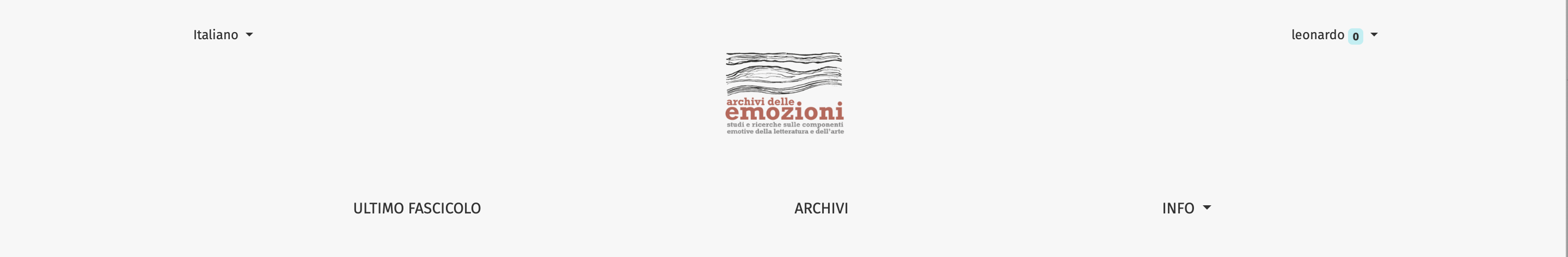
When I try to upload an image as a logo, I get it on the website extremely small, no matter which size the image is. I have prepared this logo respecting the guidelines on the theme guide ( * JPG for photographs or PNG for design marks; * of a larger width than height; * transparent background), but it seems that it doesn’t change anything.
I attach a screenshot with the result I am getting for now. There could be any explanation for this? I have tried to use the same logo of your demo, and in that case it works.
Really thanks for your support
Leonardo
The logo image height in this theme is restricted by 75px because larger size can break the look of the header. Width is not restricted. I think the best size would be around 300x75.
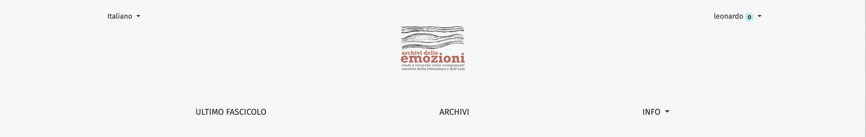
thank you very much for your answer. I have tried to upload a logo with 75px height, but, again, the result doesn’t change. I keep getting a very very small logo box. I share here the link: Archivi delle emozioni, and again an image.
Could you advise me something, very kindly?
All the best,
Leonardo
The best would to create an image first that satisfies criteria of 75px in height, keeping in mind to use large enough chars size. You can change this behavior by custom CSS, with something like:
thank you for this.
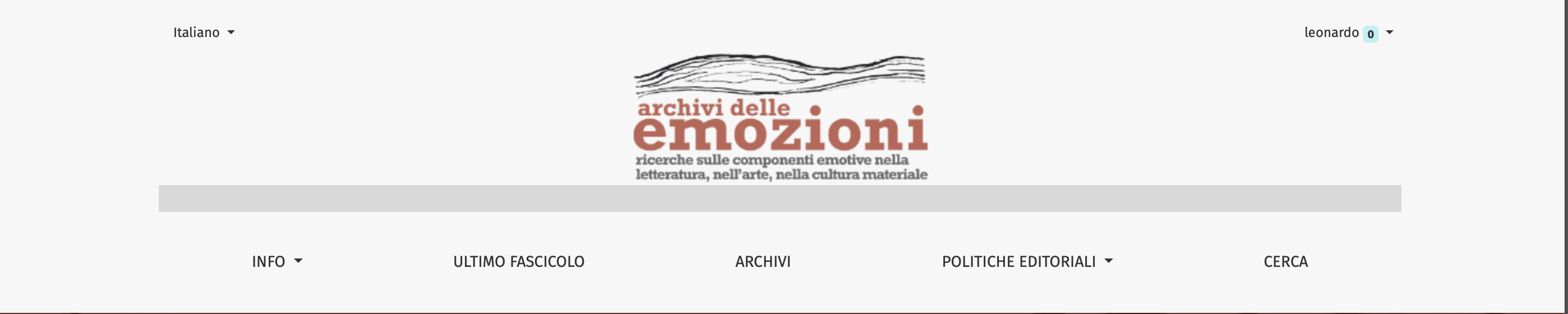
I have uploaded the css, and now the site allows me to upload a bit higher logo.
However, I would kindly like to ask you: would that be possible to erase an extra white stripe which seems to be inserted between the logo and the menu? If you click around with the mouse, you can see it. I upload here a screenshot.
I thought that maybe, erasing that extra-white space would reduce the whole impact of the header, allowing me to use a bit wider logo.
Thank you very much
Best,
Leonardo
If I delete the padding-bottom, that ‘extra’ white space of course disappears (I think it is about 19px). In my case, it could be useful, since I am trying to keep things a bit closer one to each other.
But, by the way, it’s only my personal taste (which is saying something).
Thanks again for your attention.
All the best,
Leonardo