Hi there,
I am writing in regard to OJS 3.1.2-4 and Classic Theme, v. 1.0.2 (latest).
I know that it is generally advised to use a text as logo, to avoid any problem while on tablet or smartphone. However, in this case I have really to use an image.
Given so, I am currently trying to avoid a problem with the responsive mode: since the width of logo appears to be too much for smartphone normal size (not for the super large smartphones, but for the normal ones yes) I have tried to see if I could upload a shorter logo: no! Whatever the dimension of the image I upload, the website keeps showing it with the same dimension.
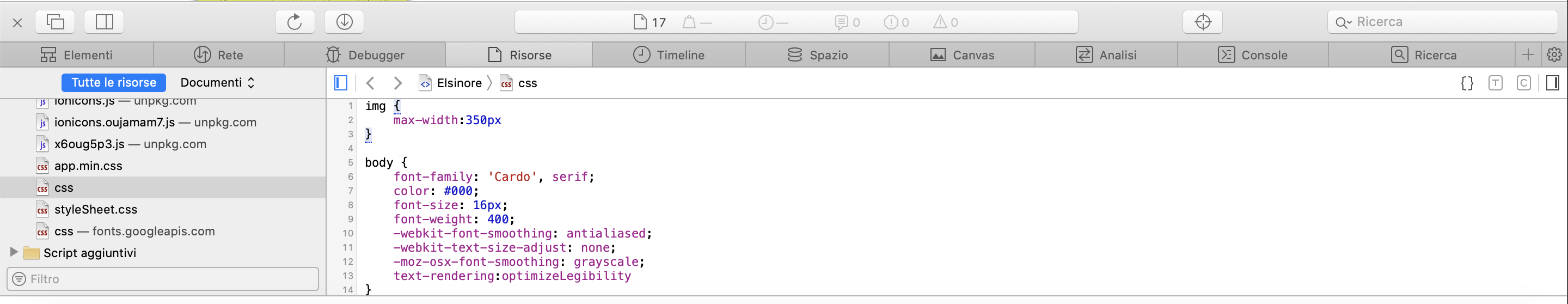
So I tried to see if with the custom.css I could try to work around this. Using the browser I have discovered that I could reduce its size with the following class:
img {
max-width:350px
}
In this case I have so tried virtually to reduce the class from the original 400px which I had to this 350px, and it worked. I said virtually because it was working on my broswer (on development/inspection mode), but when I tried to copy this class to custom.css, and then upload it to the website settings, it didn’t work.
Meaning: I still can’t manage to handle the actual behavior of the logo. I should reduce it on the horizontal size, in order to make it stay well on a smartphone screen, but I have still not managed to do so.
Anyone could share any opinion about this? I hope that this would be useful for others as well in the future.
Best regards
Leonardo