Describe the problem you would like to solve
To improve the user interface of the Tasks window.
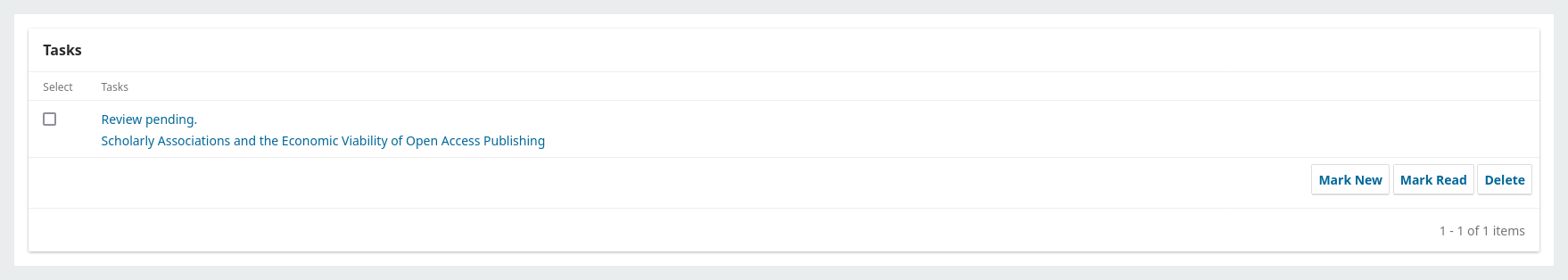
One of our journals has flagged that they find the interface of the Tasks window difficult to use and keep track of their notifications. It is fine when there are only a few new notifications, but when there are a lot, then they have found the window quickly becomes quite confusing.
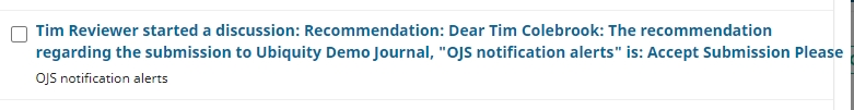
In particular, they highlighted the notifications relating to discussion messages are not easy to work with at speed.
These contain: 1) a user; 2) the action; 3) the discussion subject line; and 4) the start of the discussion message.
Describe the solution you’d like
Suggestions for improving this:
- dropping 4) from the item in the Tasks window. This adds extra content that clutters up the window and only provides a partial message. The editors are looking for notifications that are easy to read and digest, and a quick link to where they can read the message in full.
- adding a date so that the editor can see when the message was sent. Would suggest adding this at the beginning of the item.
- Placing the discussion title within quotation marks
So an item in the Tasks window would read more like this:
- 09/07/2024: Tim Colebrook started a discussion: “Suggestion for improving the Tasks window”
Who is asking for this feature?
This is coming from a journal EiC and the Journal Manager, both of whom have a large amount of task items covering multiple submissions in their Tasks window.
I second this proposal. And since the topic is relatively broadly worded, I’d like suggest another improvement, namely the possibility to handle all notifications at once, e.g. mark all of them as read without having to click the checkbox for every single item.
Hi @dennmuel @tim-colebrook,
Just a quick note to say that this post might not have anticipated changes that were forthcoming in OJS 3.5 at the time it was written OJS 3.5 has since been released - it might be worth looking at the improvements made around the submission dashboard. You can learn more about it here, and in particular, the video towards the end goes into more detail: https://pkp.sfu.ca/2025/05/27/whats-new-in-open-journal-systems-ojs-3-5-with-recording-and-slides/
-Roger
PKP Team
Thanks for your quick reply, @rcgillis!
I checked the 3.5 testdrive instance before posting and at least some points still seem valid to me, such as missing timestamps or no way to handle all notifications at once.
Best regards
Dennis
Thanks, @dennmuel
FYI: You can use the vote feature here on this post to upvote this feature request - this will help our developers identify which features are priorities in the community.
I do note that there are timestamp changes planned for 3.6. They seem to be pretty far-reaching, so I can’t say what this would look like for notifications. There’s pretty extensive discussion of that here: Review and improve types for dates/datetimes · Issue #10264 · pkp/pkp-lib · GitHub
-Roger
PKP Team
1 Like