Hello everyone,
I’d like to request a few “small” improvements in OJS’s user experience, in the editorial team area.
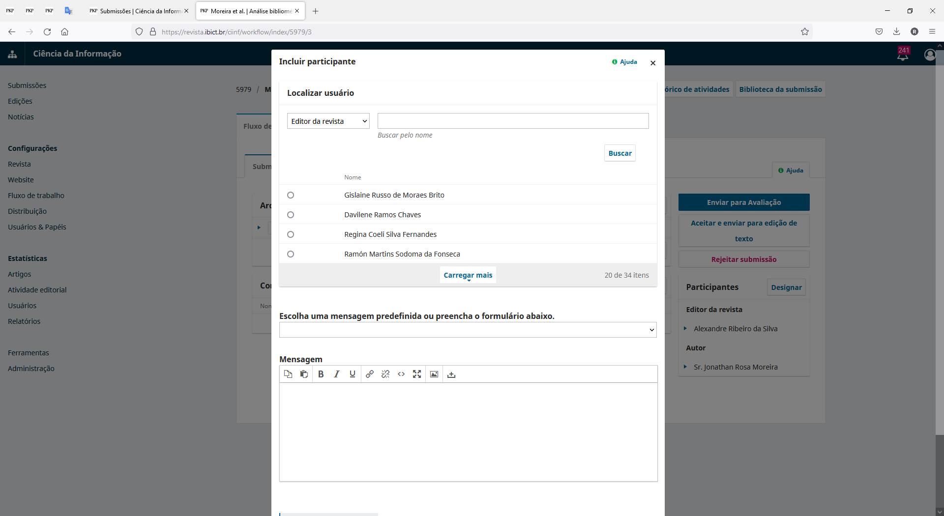
When assiging particpants, the list may or may not be long and clicking a button to load more participants is NOT a pleasant experience. It’s annoying, boring and we must go through multiple clicks to select the right editorial team member, as the listing shows first the Production Editor/Manager instead of editors. So, besides having to select the right role, we have to click a search button (could be automatic!) to list people in the journal with that role and then, if the person is not visible, we must click another button to “scroll” the list. Another boring, annoying and unpleasant experience.
My suggestion is to show the list as a dropdown select (just like the roles, but with a height larger than 5 which would show most people (as well as show a scorll to view all more easily!).
Since we can multiple select, which would be my second improvement, a simpler select menu would be a far easier and more pleasant experience, in my humble opinion.
Figure 1 - Editorial team participant modal window selection