Dear all,
we’re currently preparing the upgrade to OJS3 and tested the new design for our journal. Some of my colleagues reported back that at a certain sizeclass the proportions at the site are, in lack of a better term, strange.
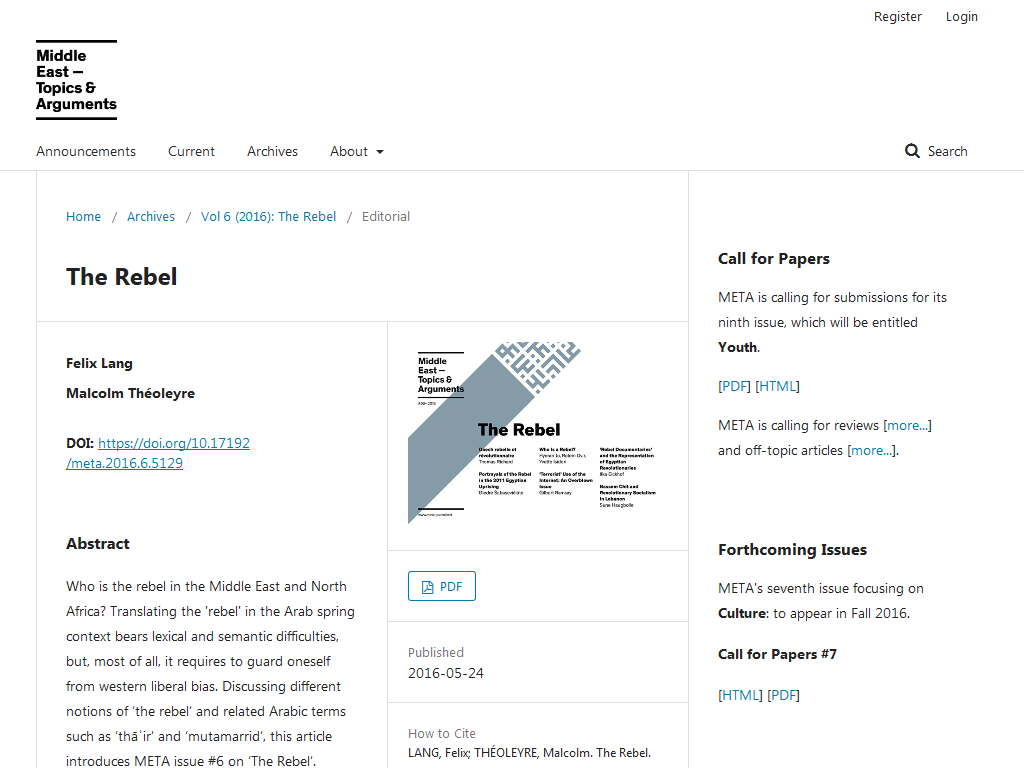
In the size class matching the iPad Mini (1024 x 768) in the article view you’ll end up with three columns
- The main_entry
- the entry_details and
- the pkp_structure_sidebar
The three columns are more or less the same size (at least visually). The width of the main_entry therefore is quite small. The main content doesn’t get the main focus on the site.
Here you can see how it would look on our OJS3 testing server (with all the custom styles removed):
I think that it would be better to move the sidebar down to the bottom, and use the gained space for the main_entry. But I’m unsure how I should tackle the problem. On the one hand I could override the styles myself for this size class. But I’m a little bit hesitant to do it like that because I’m not sure if those changes will break in the future when the default theme may be updated.
On the other hand I could propose to change it in the default theme. Before I would do that it would be good to hear from you if it’s just us or if this would be an improvement for more journals.
Regards,
Markus