Hi @Vitaliy,
I am writing here because I have noticed that my HealthScience installation behaves a bit differently from the Demo version. In particular, I am referring to the Homepage, where the white space between the “Alerts” and the Last issue summary appears to be much larger (too much large), compared to the more compact and elegant version of the Demo. I also take this chance to ask you if there is an option to disable the summary view on the homepage, since for how it appears after the alerts it is not very clear to me.
I attach here two screenshots:
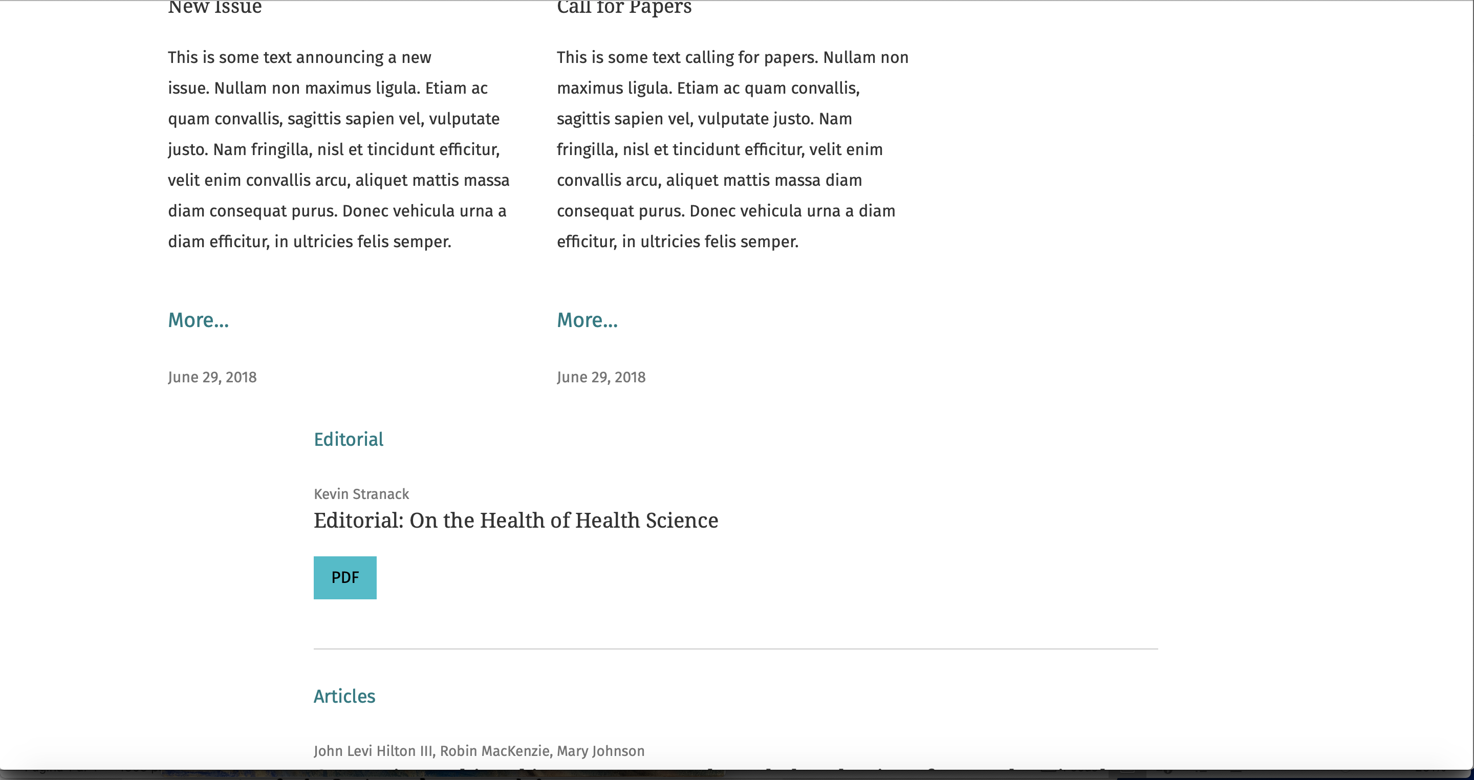
White space in HealthScience Demo, between “Alerts” and last issue summary, very reduced and elegant:
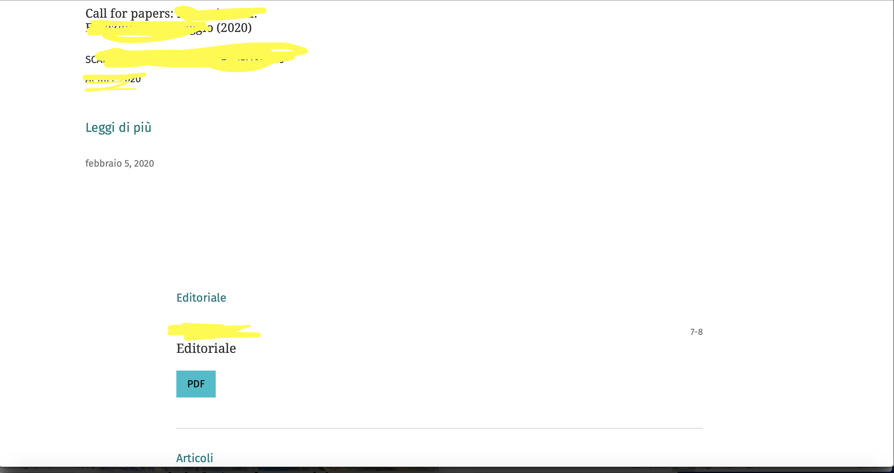
White space in my installation, very large:
Do you think I could add some custom.css code to fix this?
Thank you very much
Leonardo